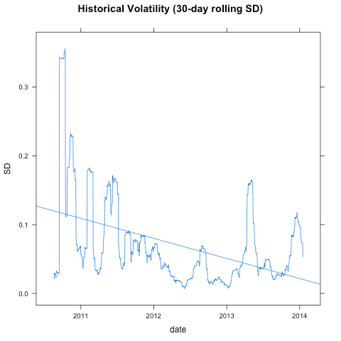
Eli Dourado has a great great blog that covers allot of issues concerning cryptocurrency, you should follow it if you don’t already. In a new post he reports that Bitcoin volatility has been trending down.
I calculated Bitcoin’s historical volatility using price data from
Mt. Gox (downloaded from Blockchain.info), which is the only
consistent source of pricing data over a long period. There is a clear
trend of falling volatility over time, albeit with some aberrations in
recent months. The trend is statistically significant: a univariate
OLS regression yields a t-score on the date variable of 15.
But the claim that “there is a clear trend of falling volatility over time” isn’t defensible at all. Before I explain why I don’t agree with with Eli, let me first replicate his analysis.
My OLS regression calibrates with Eli’s, so we’re on the same page:
                          Estimate   Std. Error   t value      Pr(>|t|)
(Intercept)           1.203775e-01 3.351178e-03  35.92095 3.489853e-194
seq(1, length(date)) -8.056651e-05 4.666856e-06 -17.26355  5.281210e-60
Putting that into English, the coefficient of the regression line is saying that volatility declines by about .00008 a day, or about 3 percentage points annually. Interpret that however you want.
And what is the daily volatility of BTC/USD?
    Min.  1st Qu.   Median     Mean  3rd Qu.     Max.
0.007301 0.027890 0.048980 0.070220 0.082930 0.355300
About 5% per day. That’s pretty wild stuff, considering that the volatility of the S&P 500 is about 0.7% per day. But patience calls, one might say, for the trend line predicts that BTC/USD volatility is in decline.
I don’t like using trend lines in analysing financial timeseries. Let me show you why. Here is a plot of the coefficient of the same regression, but on a rolling 2-year window.
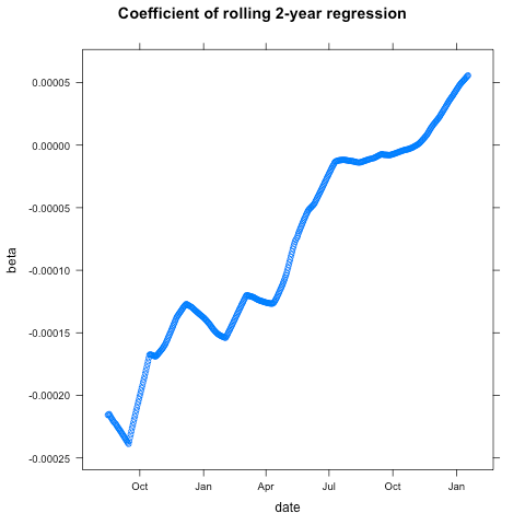
This tells a very different story. The slope of that regression line flattens out and eventually changes sign, as the early months of BTC/USD trading fall out of the sample period. Here’s how the chart looks running that regression on the last two years of data.

The trend reverses once the early stuff falls out of the sample. And there is good reason to exclude those early months from our analysis. Look at this chart of daily USD trade volume for those BTC/USD rates.

The price and volume series start around mid August 2010, but the volumes are really tiny for the first 8 months. And I mean tiny.. the median daily volume is about $3,300. Volumes get into the 5 and 6 digits after 13 April, 2011, when BTC/USD broke parity.
And before you say “that’s what we would expect, volatility to decline as volumes pick up”, look at those previous two charts. Volatility has been increasing as volume increases if you exclude the rinky dink period with sub-5-digit trading volumes.
Anyway, timeseries on thinly traded assets are notoriously unreliable. Those skyscraper patterns in the first chart are good hint that there’s some dodgy data in there. For example, Look at row 30:
                  date   price     volume         ror        vol
28 2010-09-13 19:15:05 0.06201   92.76696 -0.04598532 0.02973015
29 2010-09-14 19:15:05 0.06410 1293.53800  0.03370424 0.03019624
30 2010-09-15 19:15:05 0.17500 1035.82500  1.73010920 0.32375538
31 2010-09-16 19:15:05 0.06190   51.31510 -0.64628571 0.34284369
32 2010-09-17 19:15:05 0.06090  252.73500 -0.01615509 0.34271839
On September 15, 2010 we see a 173% daily return, followed by a -65% return the following day when the price basically returned to levels it was trading at on the 14th. Bad data point? Probably, but with these tiny volumes, does the question even matter.. this part of the series is junk.
One way of handling these issues is to prefer a more robust estimator of volatility, like Mean Absolute Deviation (this is a common practice in trading systems research). So let’s re-run the OLS we started off with–including the rinky dink period–but this time using 30-day rolling MAD instead of SD.
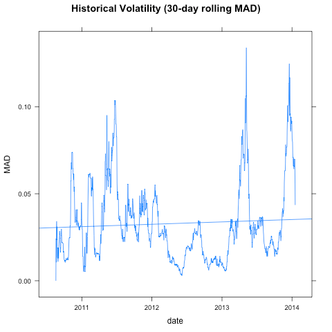
Bummer, the trend disappears. Let’s look at it another way. A plot of daily returns is always a good visual check. (I stripped out those two dodgy data points we looked at above.)

You can clearly see that the largest two one-day declines happened within the last 12-months. In fact, 4 of the 5 the largest one-day losses happened in 2013, and those were multi-million dollar volume days.
           date   price   volume      ror      vol      mad
968  2013-04-12  83.664 34740413 -0.47654 0.136859 0.075185
967  2013-04-11 159.830 38009457 -0.32722 0.097551 0.069511
973  2013-04-17  79.942 25542665 -0.27551 0.154853 0.086190
1201 2013-12-07 767.777 83625810 -0.26372 0.108006 0.091285
84   2010-11-08   0.370    34758 -0.26000 0.227176 0.064088
And the 5 largest gains? All over two and a half years ago.
          date price    volume     ror     vol      mad
169 2011-02-01  0.95   70422.8 0.90000 0.17375 0.041508
69  2010-10-24  0.19    2612.9 0.74296 0.17274 0.018748
83  2010-11-07  0.50   44081.4 0.72413 0.22559 0.067911
296 2011-06-08 31.91 3238531.0 0.67418 0.17172 0.073743
257 2011-04-30  4.15  349701.7 0.53702 0.13500 0.048596
Now, I wonder, what charts the FX guys at Coinbase are looking at…

Pingback: Virtual Mining Bitcoin News » Why Lower Bitcoin Price Volatility is No Panacea